Learnings
Many times, design decisions that can be made and that can impact vital metrics, no matter how simple they may seem, warrant usability testing.
Identifying the maturity level of the UX discipline in your business helps you make decisions, such as determining at what level results should be shared in order to highlight the importance of the area and the value we add when building digital products.
Data-driven mentality, since it is not just thinking about metrics for the sake of it, but based on a "Why?"
Important decisions that are brought to managers and stakeholders, if accompanied by research and supporting data, enable them to take the proposed strategic direction.
Developers are your allies. A good team relationship must be cultivated for effective development.
Context
Objective of the initiative
Expand the CMR Points program to Colombia and Peru, offering a unified, accessible experience focused on unbanked users, with the first milestone of increasing user registration from 130,000 to 1 million in one year.
Roles
UX Researcher / UX/UI Designer
Tool kit
Sketch, Invision, Marvel App, paper, markers and post-its.
Research Results
UI Design
High-fidelity screens, registration and login flows V1.0
These flows gave rise to the flows used in the embedded structure within Retail. With this, I began building the Loyalty Design Kit, which was part of the Banco Falabella Design System, ensuring that each component was aligned with the Banking Design System.
Usability testing
%201_37_51%E2%80%AFp_m_.png)
Falabella Financiero (Loyalty) Chile
CMR Points
Date: 2019
From its inception, this program represented a key strategy for strengthening loyalty within the Falabella ecosystem in three countries: Chile, Colombia, and Peru. This project was implemented through Loyalty at Falabella Financiero during my time in charge of the Experience, from June 2019 to March 2022.
Research
Research objectives
Design a new version of the CMR Puntos Landing Page and make it responsive, which was missing.
Improve friction in the Registration Flow: at that time there were two steps and the last one requested 10 fields of personal data from the user.
Pain points
CMR Puntos lacked its own channel, unlike its local competitors.
If the goal was 1MM and we had 6 months left, we'd never achieve it with 130 signups per day on just one channel (hopefully 23,400).
The landing page that received registrations was on Tottus and was not mobile-responsive, and additional improvements are needed in terms of content.
The bounce rate from this landing page was extremely high. 70% of users didn't complete the flow.
Research methodologies
Benchmarking on Loyalty Programs
User journey map
Survey to assess the perception that the Program did not have its own channel.
Comparative analysis
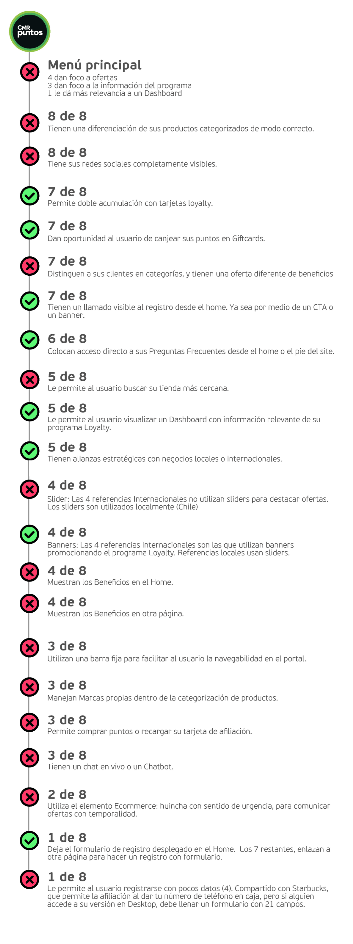
I reviewed and compared eight active loyalty programs in the market to identify best practices, opportunities for improvement, and successful patterns in terms of value proposition, content, navigation experience, and clarity of messaging on the homepage or main landing page, as well as their information architecture.

Registration in Home
As a good practice, some leading loyalty programs have a registration from the Home banner.
Registration location
After the survey, more than 50% indicated that they would first sign up for their own channel.
Mobile version
It is necessary since nearly 90% of users browse e-commerce from mobile devices.
Continuity of the Journey
The user signs up but then gets a bit lost, making it necessary to communicate what they can do to become active in the program.
Major frictions
10 fields is too much data requested from the user, making conversion during registration complex.
Own channel is vital
More than 50% of users indicated they prefer to enroll in a benefits program through their own channel, followed by apps.

CONTEXT | RESEARCH | UX DESIGN | UI DESIGN | USABILITY TESTING | IMPACT | LESSONS LESSONED
_P%C3%A1gina_12.jpg)

Survey: Where would you enroll in a benefits program?
Of a total of 32 responses, 53% would do so on their own channel.
42% from APPS (Equally divided between people who would do so in other APPS, and in the Loyalty or Benefits Program APP)


Emotional Journey Map
It's important to create a brief journey to understand user frustrations when signing up, which translates into a high bounce rate without conversion.

Wireframes
Sketches of the first wireframes, considering usage scenarios in the registration flow.


10 users in guerrilla testing
They gave us the insights we needed to identify usability issues, quickly iterate, and modify what was necessary to bring a first version into production that would deliver real value to users.
The rationale: Nielsen research indicates that testing with 6 to 15 users quickly helps identify friction and iterate faster. This worked for me in this first milestone.

Impact
Before: 130
Daily web registrations
Registrations on Home Landing Tottus, without its own channel, 2 steps and 11 fields for the user.
After: +8000
Daily APPS registrations
Registrations from the holding's Retail Apps (Falabella, Sodimac, Tottus and Linio)
Goal: 1MM
Customer Registrations All Payment Methods Expected
The OKR defined in 2019
Achieved: 1.1 MM
Registrations achieved
At the end of 2020


